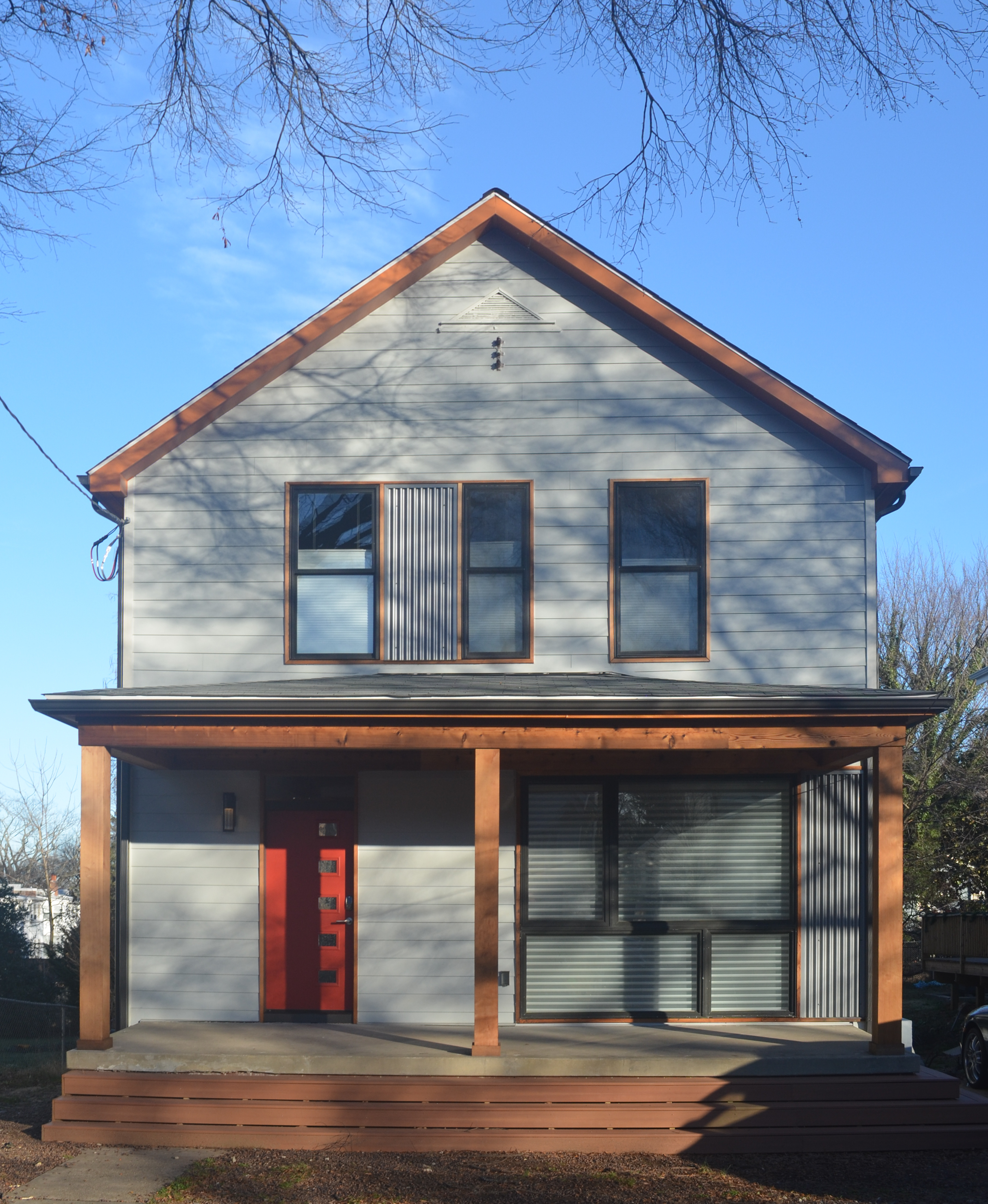
Backwards Dog Leg

Post by Catarina Ferreira, AIA

The term "dog leg" refers to the narrowing of the rear portion of a row house, to allow more light and air to penetrate interior spaces. In most row houses, the dog leg is located on the same side of the entrance door and stair, also allowing 3 bedrooms to occupy the 2nd floor: master in front, 2nd bedroom in the middle, with the dog leg providing an egress window, and a 3rd bedroom at the rear.

We are currently working on the renovation of a historic row house in Washington DC in which the opposite occurs: the dog leg is on the opposite side of the entrance door. In the original house, the stair was located in the center of the floor plan, not directly in front of the entry door, and L-shaped. It started off perpendicular to the length of the row house, came to a mid-point landing, then split off in two different directions: to the master bedroom at the front of the house and, with another set of steps, to the rear bedrooms. As a result, the owners could not walk from one end of the 2nd floor to the other, or from the master bedroom to the rear bedrooms, without going up and down stairs. It also created a very compartmentalized 1st floor and  occupied a larger than necessary amount of real estate, with its double upper runs. Hard to believe, right?

Our clients came to us with a floor plan in mind that reflected a typical row house renovation layout: single run stairs directly in front of the front door, living room and dining room on the other side of the floor plate, kitchen at the rear with access to a small yard and parking area. This plan presented two major problems: the 'bonus' window created by the dog leg would be mostly blocked by the new stair, and the location of the stair itself would eliminate the possibility of ever having 3 bedrooms on the 2nd floor, despite the fact that there was just about enough space for 3 bedrooms.


Well, flipping the dog leg would be a major effort... Instead, we flipped the stair to the other side of the row house. 


Although not as obvious at first, this layout choice solved all of he problems listed above. In addition, it created a design opportunity: the stair would now be a highly visible sculptural element upon entering the row house, not just something to walk by or up and down. It also helped to open up the floor plan visually, and improved circulation. Of course the stair had to be special. In this case, it is also the backdrop for the dining area, so more than a standard railing was desirable. We proposed a wall of see through shelving with a double life as a guardrail instead. This move also created a nice backdrop for the dining area.


By focusing on the project TEXT, and keep the options open, we were able to turn a minus into a plus.

With this simple layout improvement, the value of the property will be significantly higher, due to the possibility of making the 2nd floor study into a 3rd bedroom with minimal construction. For now, our clients will keep it an open room, but isn't it nice to know you can add several tens of thousands of dollars to your property value simply by adding a wall and a door? That's just one benefit, though: the interior spaces are also brighter and more unique as result, and until they sell, our clients will surely enjoy them more.


Not Modern Enough?

Post by Catarina Ferreira, AIA

For an architecturally conservative town, Washington DC and  surrounding cities have a decent stock of mid-century architecture, especially homes. A lot of them are desperately in need of a face-lift, sometimes a total overhaul. Mid-century renovations are one of our specialties at arc-T. 

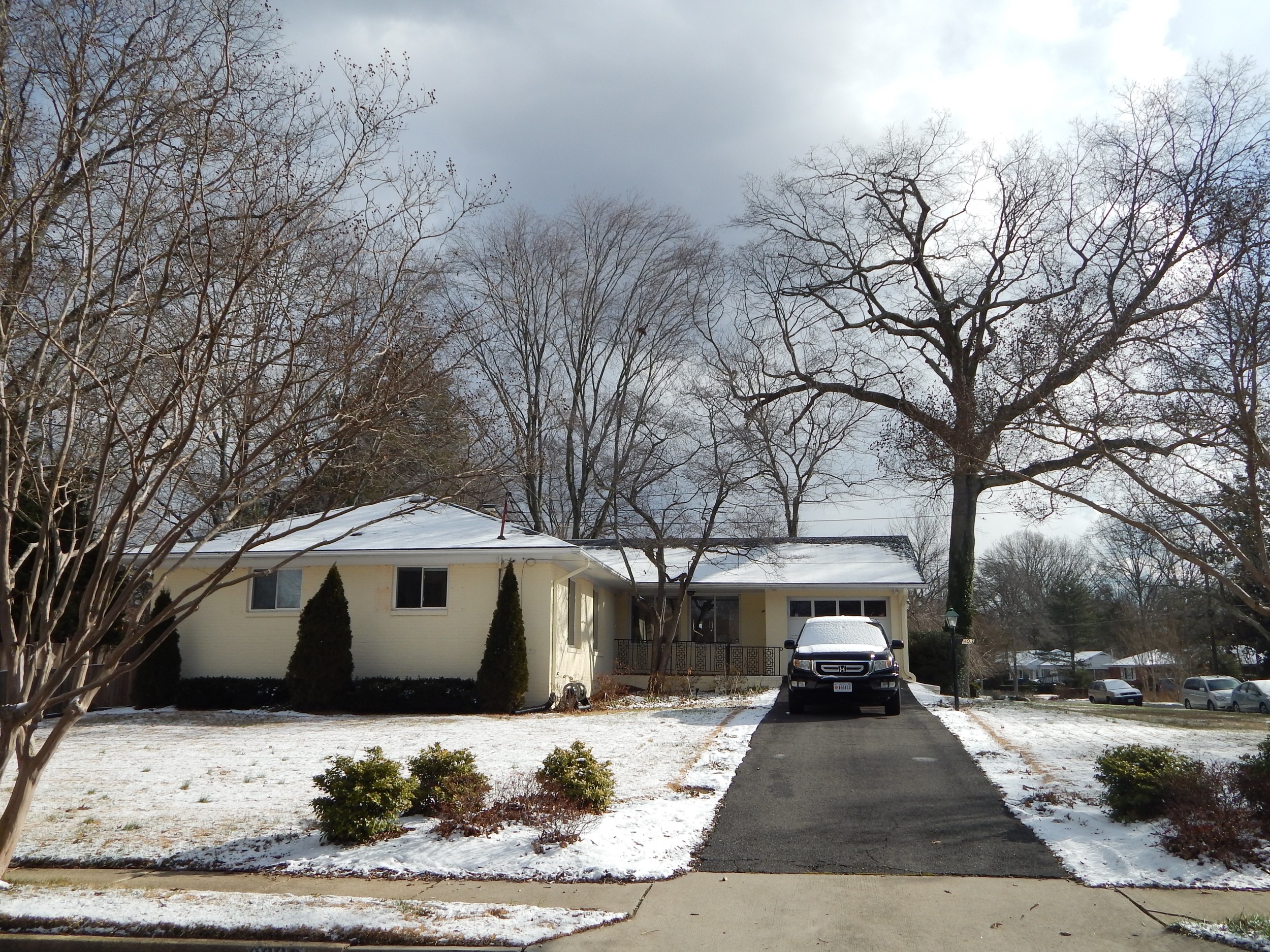
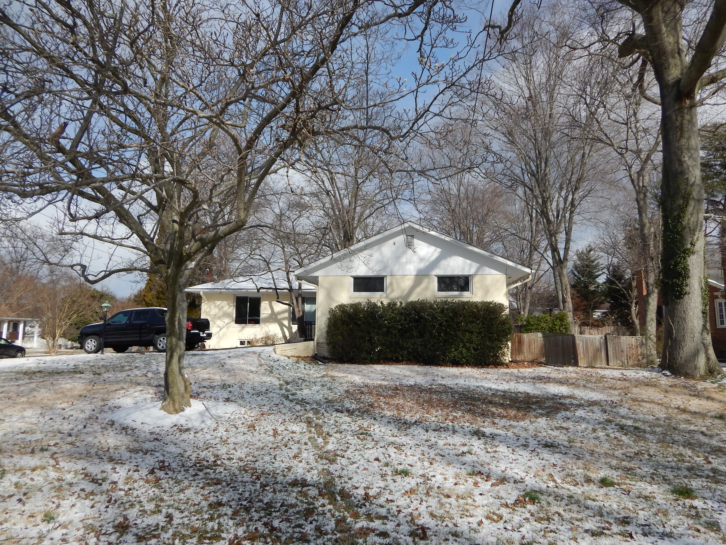
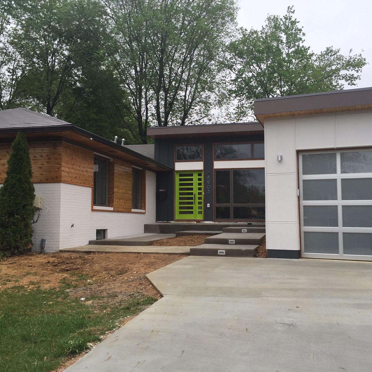
In the case of our Courtyard House renovation, our clients had purchased a 1950's home near Mount Vernon in good condition, specifically because it was a modern house, a few years before I met them. Bit by bit, their the house started to feel a bit dated, and no longer modern enough...

The house pre-renovation

I met them on a Saturday morning a year or so before they actually became clients, to talk about how they could make their dream of owning a true modern house come true, and encouraged them to buy a mid-century house in need of a renovation. After searching for a few months, my clients decided that, ironically, the home they already owned was the best candidate and gave me call. The budget was tight, as is often the case. We needed to devise a plan for transforming the house into a more up to date, comfortable modern home as efficiently as possible.

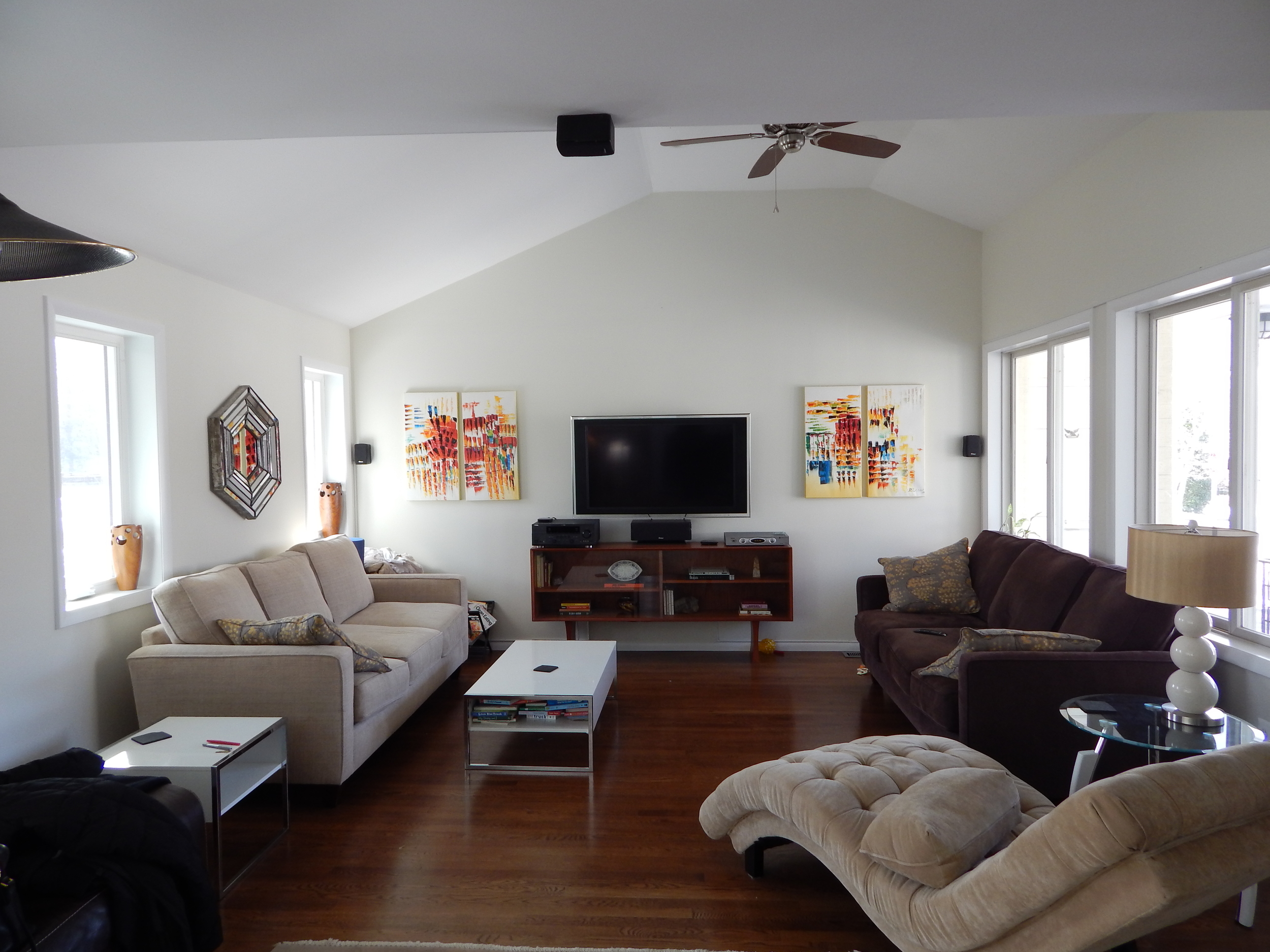
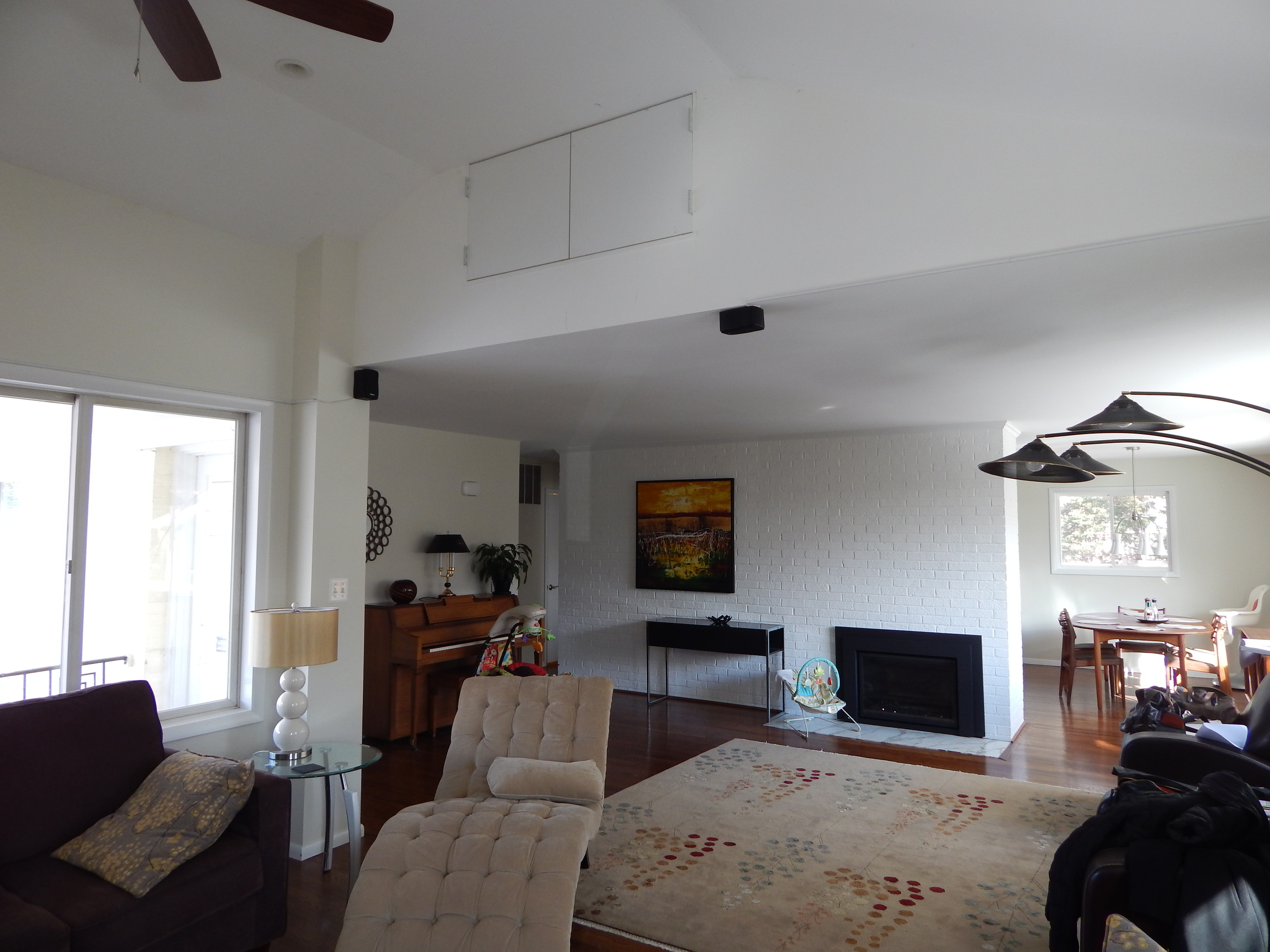
Most of the house received only a light face-lift inside and out. The big moves involved converting a small garage into an extension of the living room, raised one half of the existing gabled roof in the new living room, and adding a new garage, creating an entrance Courtyard, and added a screened porch. On the interior a new kitchen (w/ Zampieri Cucine cabinets, of course!), a new master bath and dressing room, a new hall bath and powder room were provided, in order to bring the house up to 21st century standards. 

We are giving our clients a little time to settle in, but we hope to be able to share professional photographs of this project with you soon.

More than Form

Post by Catarina Ferreira, AIA

So much has been written about Zaha Hadid and her work in the past two days. Two recurring themes stand out: 1. She was a great (albeit) female architect; 2. She was obsessed with form.

Both of these characterizations miss the point.

1. Zaha was a great architect; period. She was a great architect because she was able to elevate buildings beyond their constraints. She built poetry.

2. Her interest in form was clear, but it was not as superficial as some believe. Since the beginning of time, architects having been pushing materials to their limits, trying to create new realities. If that had not been the case, we would still be living in caves. Ultimately, her work was about pushing materials and building occupants to their limits. It was formal as much as it was experiential.

Her interest in form was perhaps a reflection of her painterly inclinations, of a cultural background in which calligraphy and having 'a good hand' are valued, in which patterns and abstractions go way back, collaged with an interest in Russian constructivism and the rigors of the AA. Is the formal intensity of her work, truly, what makes her architecture sublime? Yes and no. Minimalism is also a means to create sublime architecture, but it looks entirely diferent. Gothic architecture was sublime, but, again, very different. They all have one thing in common: an emphasis on the experience. However, they all use different formal languages.


Zaha Hadid created  buildings that appear to take flight or take off like speeding trains, she placed visitors smack in the middle of unsettling movement, on the edge of cliffs, under inverted, pointed geometries, etc. The overarching intent was to heighten the visitors sensory experience, and to make them aware of it. Every one of her buildings is remarkably different from the others, for that reason. It may not be for everyone, but neither is Baroque or Gothic architecture. Some call it self-serving architecture as sculpture. All architecture is a form of sculpure, but much more.

What Zaha did was invent a new, provocative style, and use it masterfully to create fantastic, experience-based architecture that puzzles even professional architectural critics. The patterns, the lines, the swoops, are the means for achieving this, in a more up to date and intense aesthetic than that used by other architects. The forms she invented truly created new experiences, and in her buildings form and experience are inseparable, because one cannot exist without the other, the same way that Gothic  architecture would not be the same without impossibly tall arches. This is where her genius lies. Perhaps the interest in form came first, and is so strong that it is almost distracting, but the end result surpasses it. It's Gothic architecture on steroids, with abstract contemporary music in the background.

Other architects of our time have created buildings that aspire to similar qualities, but their work fails to surpass the formal gymnastics, because their understanding of the experiential factor is lacking. Form alone is not nearly enough.  What matters is what you do with it, and what it does to you when you are in it. That's where sculpture ends and architecture begins.

image.jpg

Before/After Filmstrip

Post by Catarina Ferreira, AIA

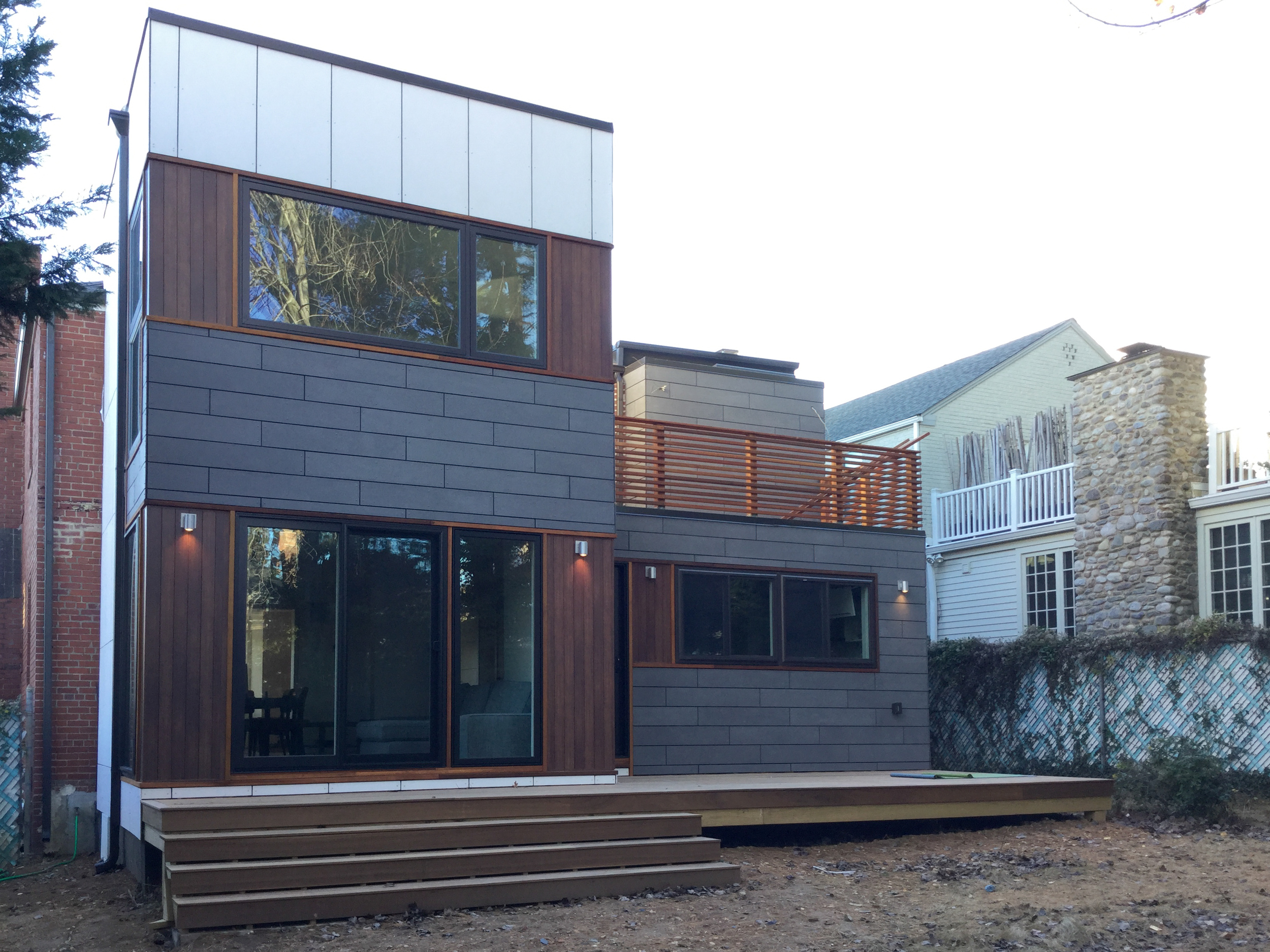
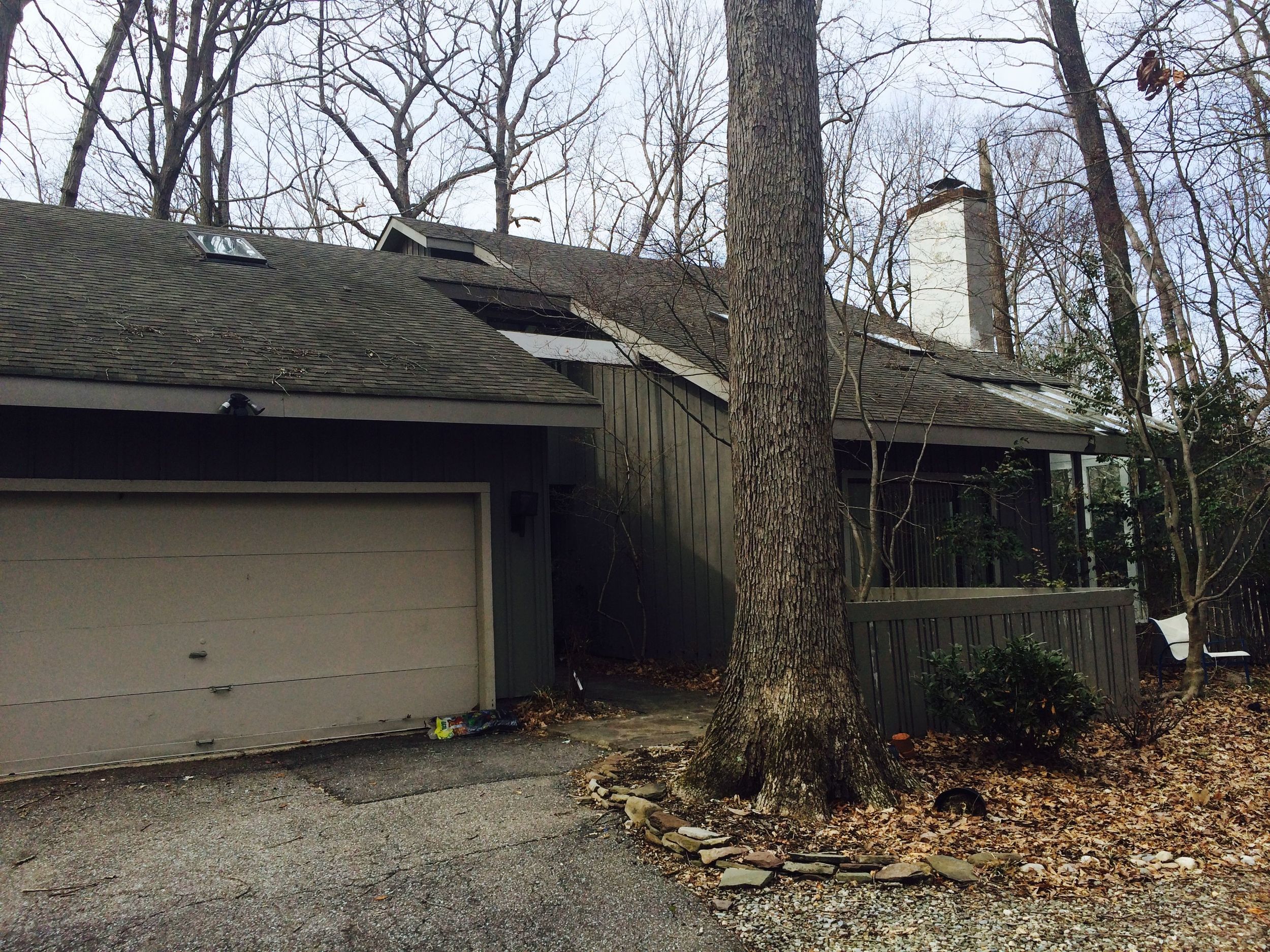
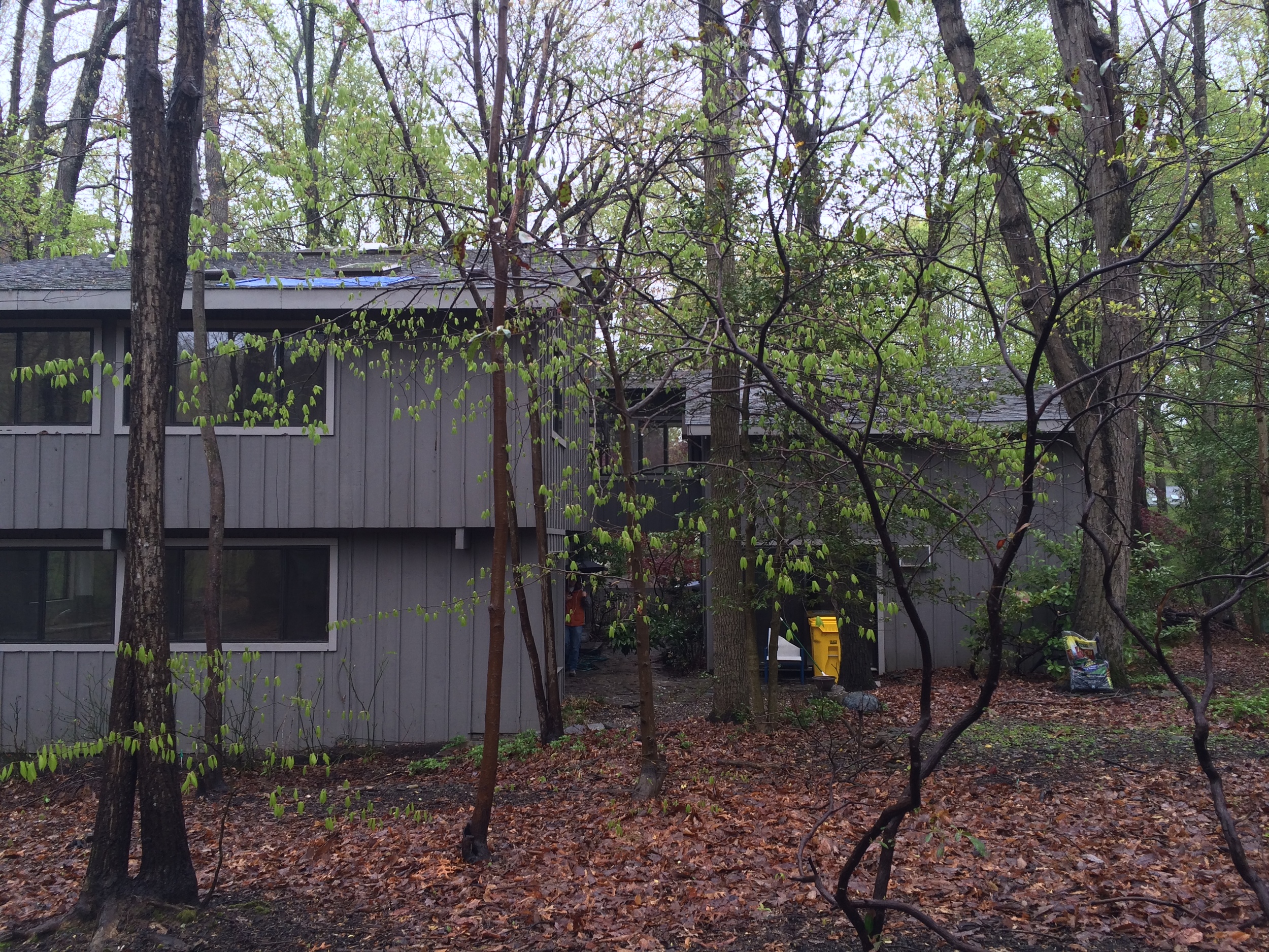
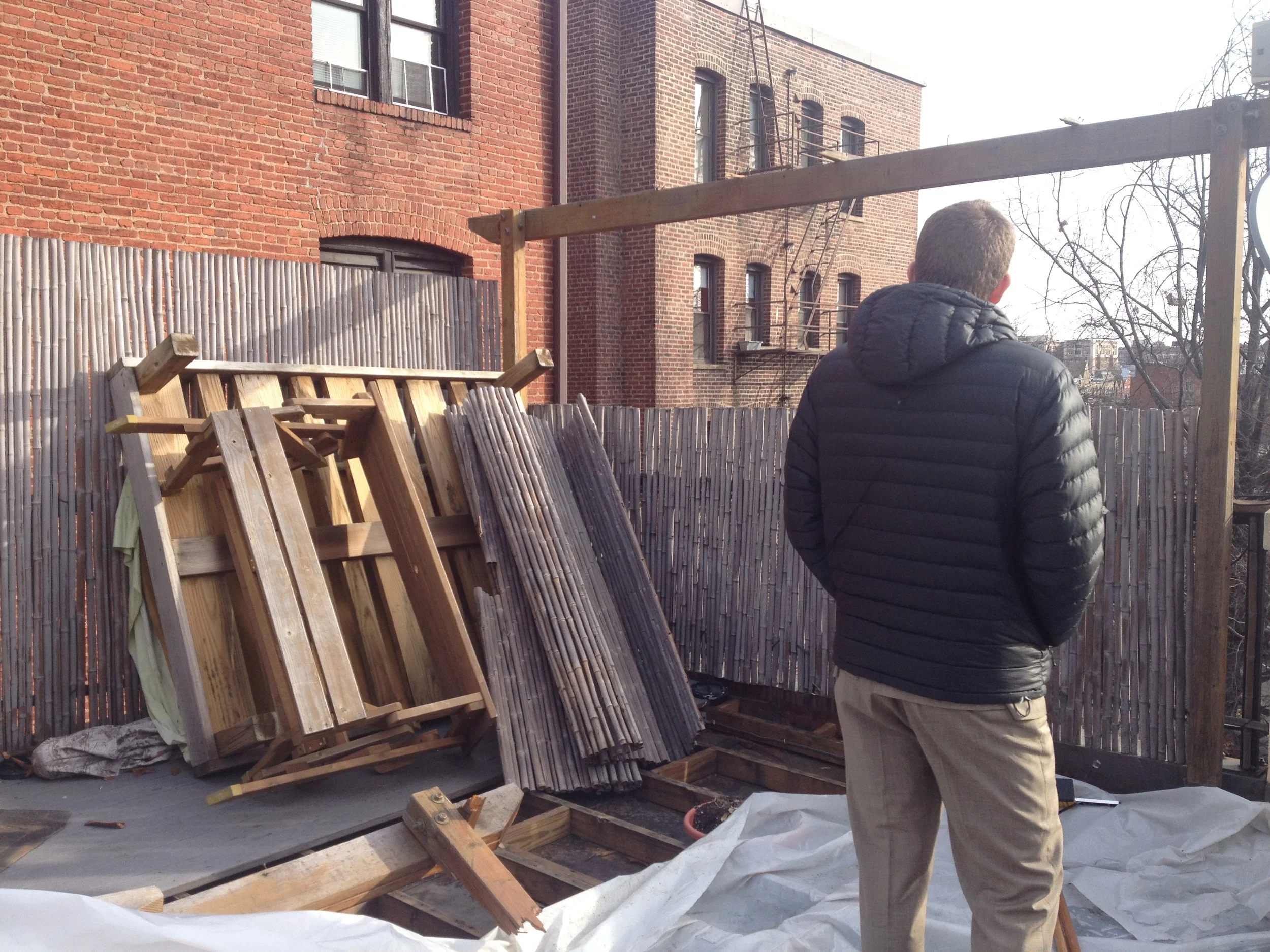
Over the past couple of years, we have been fortunate to have the opportunity to be involved in a number of residential renovation projects that have resulted in some pretty radical transformations. Here are a just few before/after exterior images of some of the projects we completed.


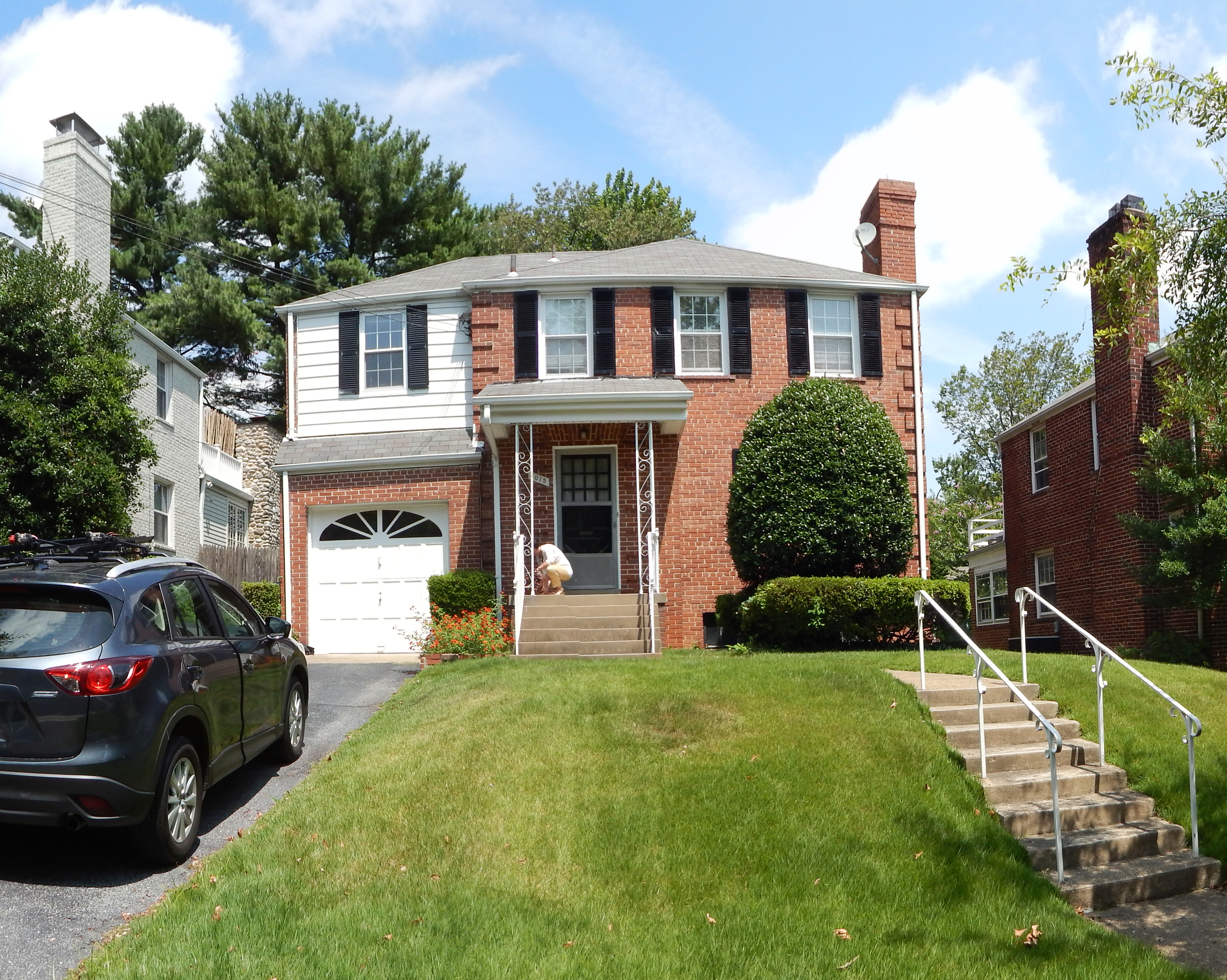
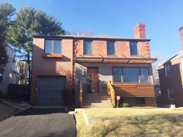
Our Cubic House Renovation consisted of a full gut renovation of a 1940's brick house searching for an identity. Work included a bay window addition at the front, a kitchen, family room and master suite addition at the rear. These interventions expanded the living space and gave the house a new personality. The interior spaces were entirely renovated as well.

Our Brookland House Renovation involved a gut renovation and addition to an early 1900's house, including a new kitchen and family room, new master suite, window, roof and siding replacement, entirely new interior spaces.


Our Annapolis Renovation involved giving a 1974 foreclosed property a new life, through a complete renovation and localized additions, involving changes to roof lines, new windows and siding, and entirely new interior spaces.


Our DC Roof Deck Renovation involved replacing a problematic, poorly built roof deck in Adams Morgan with a raised deck on pedestals, a pergola that is structurally connected to the structure of the house, an outdoor kitchen and fireplace.