DOUBLE VISION

by Catarina Ferreira, AIA

Construction at our mixed use building at 1400 9th St NW is finally picking up momentum. The initial phases of building facade stabilization, foundations and underpinning were technically difficult to accomplish and took several months to complete. Now, with framing nearing completion, the project is finally materializing and starting to look like a building , or is it two?

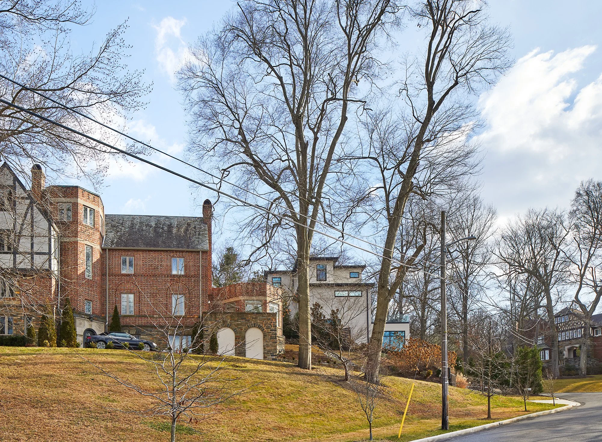
Located in the Shaw Historic District, the original building was built around 1850, making it one of the oldest (if not the oldest) contributing structures within the historic district. Vacant for decades and in poor condition, the building was nearing collapse when purchased at auction. The initial concept presented to the HPRB for review requested the demolition of the existing structure and replaced with an entirely new building. That concept was rejected, after board members visited the site and determined that the building could be salvaged. Then our job became a lot more difficult…

Typically, visible additions to existing contributing structures are not permitted. The project would not be viable without an increase in building area. Our second proposal to the HPRB, which underwent a smooth review process and was quickly approved, consisted of additions/alterations to the existing building, including a four story addition on the North side of the where a non-original structure previously existed. Conceptually, it made total sense. From a design stand-point, it seemed like an impossible mission. How could we create a coherent whole out of two such different parts? To complicate matters even more, the building occupies a corner site, making an alterations proposed very prominent. It also has no preferred orientation, and it seems that has always been the case. Is 9th St the front of is O St the front? It’s like it’s trying to be two buildings at once.

Sometimes the problem becomes the solution.

The European in me would have sought a clear distinction between old and new, so that was the starting point. However, in this case it was not just a matter of design a new building next to the old one. The original building required a significant amount of repair work and its 9th St elevation (the actual facade based on the building’s address) lacked coherence. Several poorly-designed alterations had been made over the last 170 years or so.

Sometimes the answer is not about black vs. white but rather shades of grey. The ultimate solution is a hybrid building that blurs the line between old and new just enough to make a passer-by do a double take. It looks like one building from farther away, like two up close. This allowed the integrity of the historic structure to be maintained, allowed us to propose a clean addition that is distinct yet compatible, and most importantly, one does not try to mimic/reproduce the existing building.

Often, in Washington DC, the tendency is to mimic the appearance of historic structures or to propose a slightly watered down version of them in order to try to achieve compatibility. That erasure of history, by replicating a historic language in the present, reduces the proposed and the original building to nothing more than their appearance. To me, architecture is about poetry, creating a rich experience by manipulating the grey zone, not about superficiality/appearance. Historic districts are first and foremost about a coherent atmosphere.

So how did we achieve a coherent atmosphere/ historic compatibility in this case?

  1. My number one go-to strategy in historic district is always simplicity: simple massing, discrete character.

  2. Then comes soul/personality: In this case, is it one building or two? It seemed important to maintain that duality. Also, a raw, slightly industrial aesthetic is proposed in both parts of the building. I feel this is compatible with the character of this particular historic district, where alleys are streets, carriage houses are homes, and just a dash of grit prevails.

  3. Then comes continuity of materials: same brick color/size, same siding material on bay windows, same window color, despite different geometry/size.

Now that it has taken shape, the verdict is in: it is one building, but its also two at the same time, as has always been the case. Amazingly, I think it actually works!

THE BUILDING THAT WASN'T (YET)

by Catarina Ferreira, AIA

Some projects seem too good to be true. I’m sure many architects out there can relate to this. After all, my firm had already designed two other buildings for that block and half, both of which are currently under construction. Three buildings within 1.5 blocks? No way, I thought. No way was correct.

A few months ago, I was asked to prepare a conceptual design for a 40-unit multi-unit apartment building to be located on 1322 9th NW. The site has been a parking lot for as long as anyone can remember. Various projects have been proposed for that site and one by one they were all abandoned. This one was charmed, though, or so it seemed.

When a hotel was proposed for the site a couple of years ago, there was strong opposition from the neighborhood; everyone wanted more housing. There were also several zoning relief requests associated with that proposal. So, we gave them more housing, with no need for zoning relief. There was no neighborhood opposition to the proposed building, no ANC opposition, and we were slated for HPRB concept approval this past April in the consent calendar, postponed to May due an adjoining neighbor’s expressing some concerns regarding the view of his historic courtyard being blocked from the parking lot, street and alley by the proposed building. Well, no offense, but the beauty of courtyards is that they are intimate, mostly enclosed exterior spaces and they are best experienced by being in them, not from the outside. How about giving private tours? Just saying… I would have enjoyed attending that hearing for sure, but the application was withdrawn before the hearing date.

So, how exactly did this project get derailed after such a promising start, you may wonder…

Interest rates rose between the time the purchase deal was made and the concept (almost) approved. Current interest rates have had an enormous impact on developers’ ability to bring projects from concept to reality. Construction loans are often interest only, variable rate loans. With current interest rates, developers (and borrowers in general) are paying twice as much in interest on any loan. When you need a few million to get a project built, twice as much is a lot. In addition, when the cost of money is so high and construction costs are also high, it’s a double obstacle: paying twice as much at twice the cost of money. Given those obstacles, a lower purchase price was needed in order for the project to be viable, so the original purchase deal fell through.

Luckily, the HPRB’s position towards the proposed design does not change regardless of who the buyer is, and we, as architects, own the design concept, not the previous would-be purchaser. The concept can be re-presented to the board if a new buyer appears with the intent of building the same project type.

A BUILDING WITHIN A BUILDING

by Catarina Ferreira, AIA

Our 9 unit + office mixed-use building on 9th St NW, in the Shaw and Naylor Court Historic Districts, is well into construction. Underpinning was just completed. It was no easy task.

At first glance, the design proposal looks like a building on top of a building, but in reality, and as far as construction is concerned, it is a building within a building. The construction photos below make this clear.

What looks like an enclosed space in the photo above are actually foundation walls for an exterior sideyard in the central part of the building.

In order to preserve the existing historic carriage house at the rear of the building, a series of steel beams were introduced in order to create a temporary bridge under which to excavate, underpin foundation walls, and eventually frame the first two stories of the building. Once the existing structure is supported by the new construction under/within it, the steel ‘bridge’ will be removed and construction can progress upwards, in a logical sequence, instead of downwards, as has been the case up to now.

While the end result appears to be simple, it’s easy to underestimate the complexity of building a project such as this.

The proposed alterations to the carriage house, with taller portion of building visible beyond.

The end result will be not so much an addition onto a historic building, but rather a sleek, contemporary new building within the original historic structure.

MEMORY VS. CARICATURE

by Catarina Ferreira, AIA

birdseye.jpg

Working within historic contexts is always a challenge. I recently presented a design concept for our 9th St Mixed-Use development to the DC Historic Preservation Review Board. The discussion with board members was a fruitful one, and I found myself having to explain how I believe compatibility with Historic fabric can be achieved, beyond respecting massing and scale, without resorting to creating caricatures of it. I found myself saying: “there is much more value to historic buildings than their appearance.” I strongly believe that replicating their appearance provides only a superficial level of compatibility, and does not lead to quality architecture.

Alain de Botton is a philosopher an writer whose work I enjoy. One of his books is titled ‘The Architecture of Happiness.’ In this book, de Botton confirms what I have believed for a long time: memory is the mechanism through which happiness can be triggered by architecture. de Botton also states that evoking memory is best done with subtle hints, not literal reproductions of particular memories. I believe the same applies to working within historic contexts. I know this to be a fact. On my first trip to Italy over 20 years ago, during a study abroad program, it was a particular crispness in the autumn air combined with the sound of traffic and motorcycles and smell of espresso that made me feel at home, not so much the many visual architectural and urban similarities that exist between Italy and Portugal, where I grew up. Somehow when there are too many similarities, it is the differences that stand out. I agree with de Botton that memory is triggered by subtle, often invisible things, by atmosphere, not decoration, and is created by experiences, not appearance (unless it’s the real thing). How to create atmospheres that trigger memories and (hopefully) architectural happiness is certainly a large, elusive goal, but one of my professional quests. Strangely, not many architects seem to have written about this to date; I’m glad philosophers have.

Along Washington DC’s 9th St NW, historic buildings are often comprised of a front building with commercial space at ground floor, residences above, an open outdoor courtyard, a carriage house, an alley. There are large glazed surfaces, often divided with slim mullions, creating a latticework like appearance that is engaging, inviting and adds significant character to the streetscape and interior spaces alike. There is also a simple, slightly industrial/utilitarian aspect to the carriage houses and portions of buildings facing the alley.

A frontal view from across 9th St NW.

A frontal view from across 9th St NW.

Our proposed building tries to evoke the memory of traditional buildings in that portion of the city in the following ways:

  • Our building replicates the traditional arrangement and sequence of spaces, down to the utilitarian carriage house at rear, the private path to the alley along one side, the open courtyard to bring in light to the interior of the block.

  • The front glazed facades evoke the large glazed storefronts that occur up and down the street, and sit lightly on top of the existing building, instead of hiding by trying to replicate traditional roofscapes. They are visible but ephemeral, confident but respectful, and I believe they are positive additions to the building, and contribute to creating a more memorable architectural experience of it from all angles.

  • The interior courtyard/side yard space is surrounded by simple wall surfaces, black mullioned glazed surfaces, and contains a partially open stair leading to a roof deck, eluding to the industrial aesthetic often found in the traditional courtyards. It is a secret space of sorts, as are the historic courtyards, hidden from view from the street and alley side, and provides precious light to the dwellings that face it.

  • The carriage house reflects a similar simple, industrial aesthetic, and replicates historic functions in existence along many Washington alleys: parking, passageway to alley, an apartment on top.

  • The treatment of interior spaces within the building will reinforce the atmosphere defining qualities of the building described above.

An aerial view from the North.

An aerial view from the North.

Interior view of one of the larger dwelling units in the building.

Interior view of one of the larger dwelling units in the building.

Some comments were made about the scale of the building, which is slightly taller than others on the block. In reality, similar disparities in height already exist. Many buildings along that side of 9th street vary in height by one story or more. There is a tendency in Historic Preservation circles to accept such conditions if they already exist, but not necessarily when they are proposed in new construction or alterations. It is important to recognize that present day is also part of history, and we shouldn’t have to hide behind the past.

I believe great cities are made of layers of history, that coexist in a positive way, helping to create an overall more memorable urban experience, and I am confident that this building will do that as well.

Thank you, DC HPRB members, for your unanimous support of this concept application, albeit with the condition that we take a second look at the scale and massing of the rear addition and carriage house alterations. I wholeheartedly agree that this aspect of the project requires further refinement.