Post by Catarina Ferreira, AIA
At archi-TEXTUAL we like to refer to a project's set of conditions and constraints as 'TEXT.' What exactly do we mean?
Design for us is about synthesis, much like writing a research paper. First we observe, we gather information, we learn about the subject (site, building, client, etc). Slowly a gestural, common sense response to the text emerges. You could call it a thesis of sorts, or, as many architects refer to it, a parti. From there, various elements start falling into place and reinforcing that thesis, so that what emerges in the end is clear, coherent and legible. That is our goal. Do we actually pull it off?
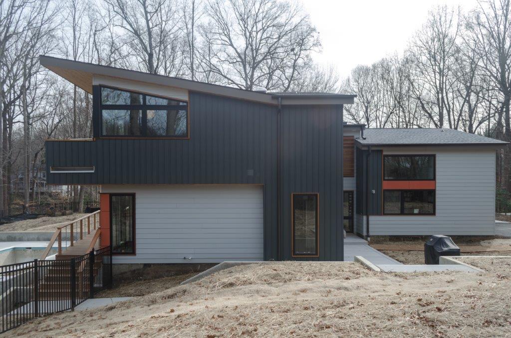
Let's use our recently completed Annapolis Renovation project as case study.
The existing 1974 house, in an heavily wooded site in Annapolis MD, had great text already: thoroughly a 1970's Brady Bunch type modern, with the carpeted stairs, the sunken conversation pit, the vertical (drab) grey painted cedar siding. It could only get more interesting.
the house pre-surgery, w/ garage in front
the previous stair
the space now occupied by a vestibule
Our clients were interested in maintaining the flair of the house, while addressing its perceived problems: the heaviness of the roof lines, the awkward entrance between two volumes, under a bridge, and the visual lack of a proper front door (the garage was the welcoming committee) , the outdated interior spaces, the structural issues, etc. The house had many problems... the budget was tight (as always!). What could we do? In addition to addressing all of these problems, our clients also had a very green agenda.
In order to maximize the bang for the buck while addressing the various issues listed above, we decided to use surgery as a strategy. Roofs were lifted in strategic portions of the house, dramatically change it's massing and creating more open living spaces and master suite, for example; the two separate volumes were connected by a new entrance volume with a very welcoming front door; the dated staircase was replaced with a new one but the opening reaming unchanged, decreasing the need for structural alterations; the sunken conversation pit and hot tub removed, creating a larger, more open living room.
Other textual layers were added on: a love for the color red, glass railings, and raw black steel; a desire for a taller ceiling in the kitchen/dining area; a desire for an entrance that made a statement. A house with a distinct identity started to emerge during design development, and remained pretty much the same through completion, despite cost/value driven concessions.
What we ended up with in the end is perhaps more interesting than if we had designed a new house from scratch, and the old house is still there somewhere. Hopefully it speaks for itself, so I will now let the photos do the talking...
For more photographs of the finished house, go here.


