post by Catarina Ferreira, AIA
archi-TEXTUAL is known for clean, contemporary architectural design. While that is our preferred style, our work always tries to be more than skin deep.
From time to time, we run into a client that challenges us to go against our norm, and asks us to tone down our stylistic preferences, in favor of a more timeless, 'warmer,' more marketable look. How to do that without compromising our integrity, without selling out and going mainstream, is the question. Can we really do beige instead of pure white? Well... maybe warmish light grey. Is that warm enough for the mainstream?
I happen to believe that good architecture is so much more than skin deep, that when it is good, style is truly just a detail. Still, you will not catch me designing a 'neo-colonial in this lifetime'...
How to please our clients while sticking to our belief that contemporary architecture is more than just a style and is here to stay is a true challenge. Is it possible to produce 'style neutral' architecture? That is an old question... when modernism first emerged, one of its goals was to be the 'non-style.' These days, even 'transitional' (whatever that means) is a style.
We don't actually think, or design, in a style; contemporary aesthetics are the default given the times we live in, the materials and technology available to us, and our desire to push the envelope. Our focus is much more on the quality of the building/space, though, not what it looks like.
I guess the answer is YES: we can do 'style neutral' without selling out. How exactly can we do it?
Let us take a look at our Shaw Multi-family project as an example. We recently published a short blog entry about this project here
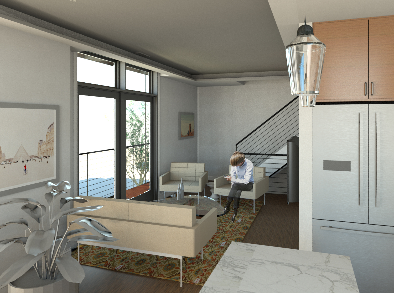
View from Kitchen to Living and Stair in Upper Unit
While the exterior of the building was a design challenge in itself, the true challenge was fitting four 2-bedroom luxury condos into it, while maintaining design and spatial quality. Our strategy was to try to produce clean simple spaces, with lots of natural light, tall ceilings, functional, elegant interior layouts, no matter what our client wanted them to look like.
View from Kitchen to Living and Dining area in Lower Unit
The only way to fit 4 units into this building was to create open floor plans, with open kitchens and undefined living spaces. These were not going to be traditional apartments... The size of the units and the desire to maximize their perceived spaciousness also dictated that the railings on the stairs should be as open as possible, that our material palate should be simple and light-handed, and that our fixture selections should reinforce that. These are all non-traditional moves. Dark colors were selected for windows, railings, fixtures, adding consistency and a light handed industrial mood, again non-traditional. That mood is a carryover from the building's exterior, where red brick meets black steel bay window was our concept for merging old and new. The apartments in this building were never going to be anything but of this day, even if we tried otherwise.
View from Kitchen to Entry, Dining and Living areas in Lower Unit
Fitting the units into the building predisposed many other aspects. The difficulty of this task made style a non-issue. First and foremost, we had to solve the problem!
The biggest design challenge was reconciling the program of requirements for the units and the open floor plans with the old building's inherent quirks and unusual footprint. Ultimately, the problem became the solution. We used the building's quirks as a guide by locating dining areas in the buildings bay windows when possible, and setting the stage with an attractive, timeless pendant light fixture over them, immediately gave the spaces a sense of 'timeless elegance.' Configuring the living room seating in the area adjacent to the new upper level French (not sliding) doors onto the balconies did the same for that space. Locating these functions strategically introduced a dash of formality back into the spaces, and, again, that timeless elegance we were looking for. Secondary spaces fell into place, and we even ended up with a decent amount of modularity in kitchen and bathroom layouts.
Finish selections fell quickly into place: walnut hardwood floors, timeless white and grey marble countertops and backsplashes in the kitchen, grey and white marble tile in the bathrooms. A light cove around the perimeter of the living spaces evokes crown moldings often found in buildings from the time period this one was built in without being too literal.
Little by little, the project developed its own aesthetic; its own 'text.' It fell into place without us having to force an aesthetic onto it. Is it conservative, or elegant? Is it timeless? Hopefully it is whole and true to itself.


