Post by Catarina Ferreira, AIA
Our Foxhall Renovation project, completed last year, was already a stunning modern house before we got our hands on it. It was designed by DC architect Richard Ridley in the late 1970's. We were asked to give it a face-lift (literally), and improve its energy performance. There was a write up about the house in DC Urban Turf back in 2010 when it was last on the market.
The scope of the project also grew to include a kitchen addition and renovation. The intent of our intervention was to make the house reflect present day construction materials and techniques, and try to remove the identifiable period aesthetic that architects tend to love, and homeowners tend to hate, and arrive at a more timeless solution through light-handed, precise interventions. Our design process consisted of a thoughtful analysis of, and respectful approach to making alterations to the existing building.
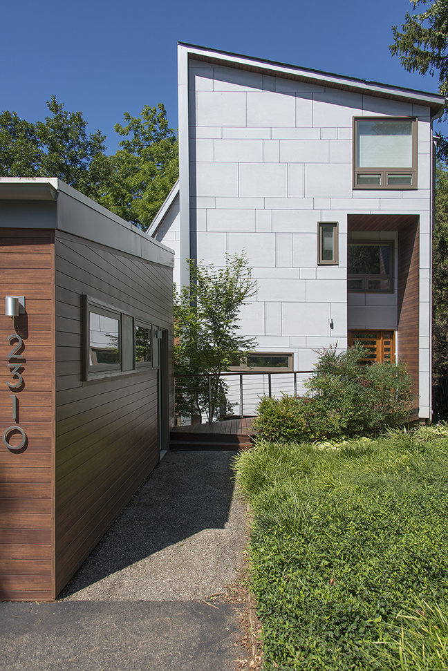
Altering a true modern house while maintaining its spirit is hard to do, and that was certainly the case with this one. The task we were given was to address both technical issues and the overall dated appearance of the building. Insulation was added to the exterior envelope (on the outside of the wall to avoid disturbing the interior finishes), roof materials, gutters and downspouts, windows and doors were replaced with higher quality building products. Cedar siding had been used uniformly on all exterior walls, giving the house a sculptural nature, but also lacking in scale, hierarchy and syntax. It is probably safe to say that Richard Ridley might have used rainscreen fiber-cement siding if it had been available in his time. It achieves a similar end result as the original vertical cedar siding (minimal, monolithic appearance). The verticality itself is an aspect of the cedar siding we decided not to replicate en masse, given the tall narrow volume (in a long narrow site) that the house is. Instead, our fiber-cement siding has a horizontal disposition, and a playful pattern for scale and interest.
In addition, instead of using the same material throughout, we felt the need to break down the previously sculptural yet monolithic volume into a couple of coherent parts. The fiber-cement siding was used to define the main volume on all sides (material 1). The plasticity of the volume was emphasized by the introduction of wood toned siding in the entrance overhand, which was also used elsewhere for small protrusions beyond the walls of the main volume (material 2).
We also introduced a skin of standing seam metal roofing (material 3) that peels itself away from the main volume to accommodate a wider portion of the house on the 1st floor, behind which is a double-height living room with a sculptural ceiling profile designed by the original architect. Here the verticality seemed appropriate, emphasizing the peeling away effect and contrasting with the horizontality of the fiber-cement siding panels. It also pays a certain homage to the original appearance of the house.
We treated the rear elevation in a similar way as the front. A bay window like volume protruding beyond the main volume was clad in wood toned siding.
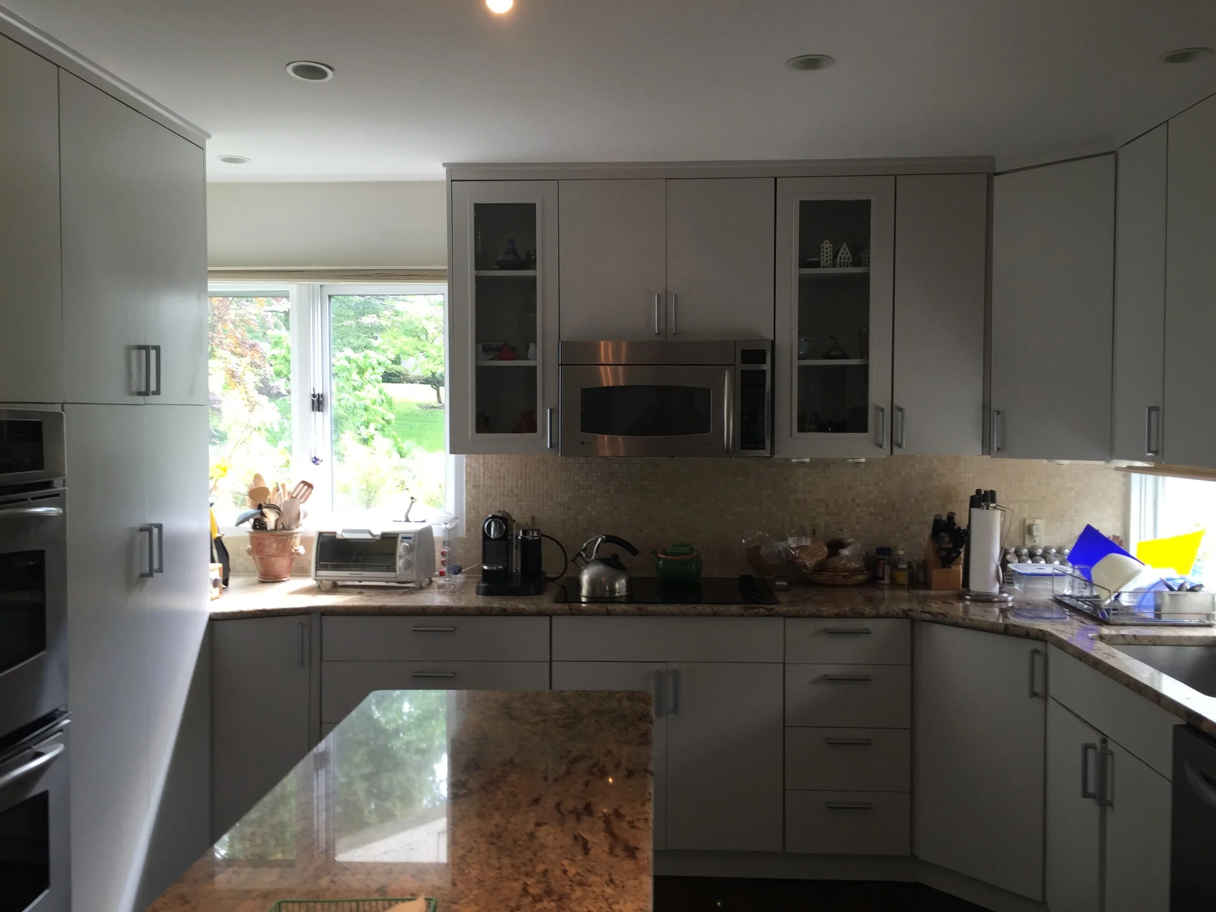
A new, much more spacious kitchen was accomplished by building a small addition on one side of the house. This smaller volume was also clad with wood toned siding.
For more images of the completed project, go here.


