Post by Catarina Ferreira, AIA
No offense, Mies, but in my opinion 'Form Follows Function' doesn't tell the full story. It's a powerful phrase, and it summed up the intent of design in the machine age, but it implies linearity in the design process. Mies' buildings are stunning works of art, and I would argue they were driven by more than function. After all, architecture is more interesting than pure engineering, in which form only follows function. I would argue that in architecture Form Follows Function and Function Follows Form, and it goes on and on like that in a somewhat circular fashion until the design problem is solved. Form and Function inform and reinforce each other. Although function certainly comes before form, recognizing the power of form and treating it as an equally important participant, and not merely as the result of function, can help to propel function itself to an entirely new level. That's how inventions come about, for example.
At ARC-T, our work is sometimes spoken of as a bit 'out there' (at least for Washington DC). Some say that the form(s) in our projects are somewhat unconventional. Actually, the form(s) in our projects are very much the result of the thought behind the project, and often the outcome of spatial manipulations that try to maximize the use of space and improve our clients' quality of life and use per square foot. We believe that architecture should aim to be much more than skin deep (really), so as much as believe there is more to form than function, we also believe that form is not the driver. First comes intent (or function), that intent takes on a certain a form, which then informs the intent, and perhaps even changes it.
Here's an example:
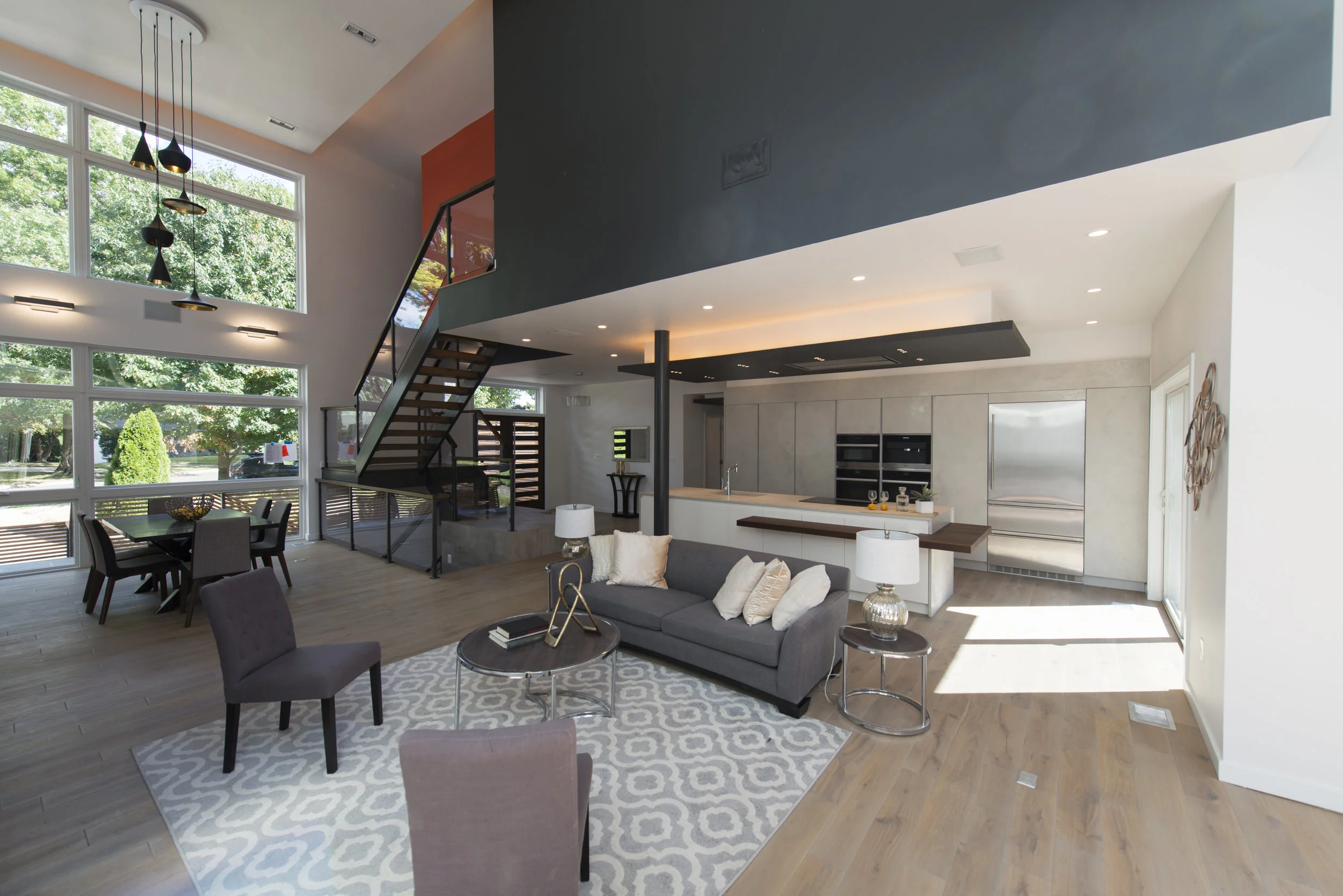
Our recently completed Bethesda Renovation/Addition project had ambitious goals from the beginning: we attempted to transform a 1950's house with good bones into a new modern home while leaving most of the original house still standing, by adding a 2 story volume onto 1/2 of the footprint of the house. The addition included a new master suite on the upper level and grander public spaces on the 1st level than the original house previously had.
There were a couple of obstacles in our way: 1. the side setback limit dictated the angled roof/wall at towards the rear of the new addition; 2. the stair seemed mathematically impossible to work out while maintaining proper clearances for the dining room, and allowing us to create the spacious master bathroom above that our clients desired.
The side setback limit dictated the shape of the living spaces and started a domino effect of angled flying roof planes that became part of the language of the house. The side setback dimensional constraint also caused us to cantilever a portion of the master bedroom over the dining room, eliminating the need to have a column in the middle of the living room itself (it is neatly located near the kitchen island. That column is a crucial structural element, and picks up a significant amount of floor and roof load. Eliminating it entirely was not a viable option, but that would have been some serious form-bending.
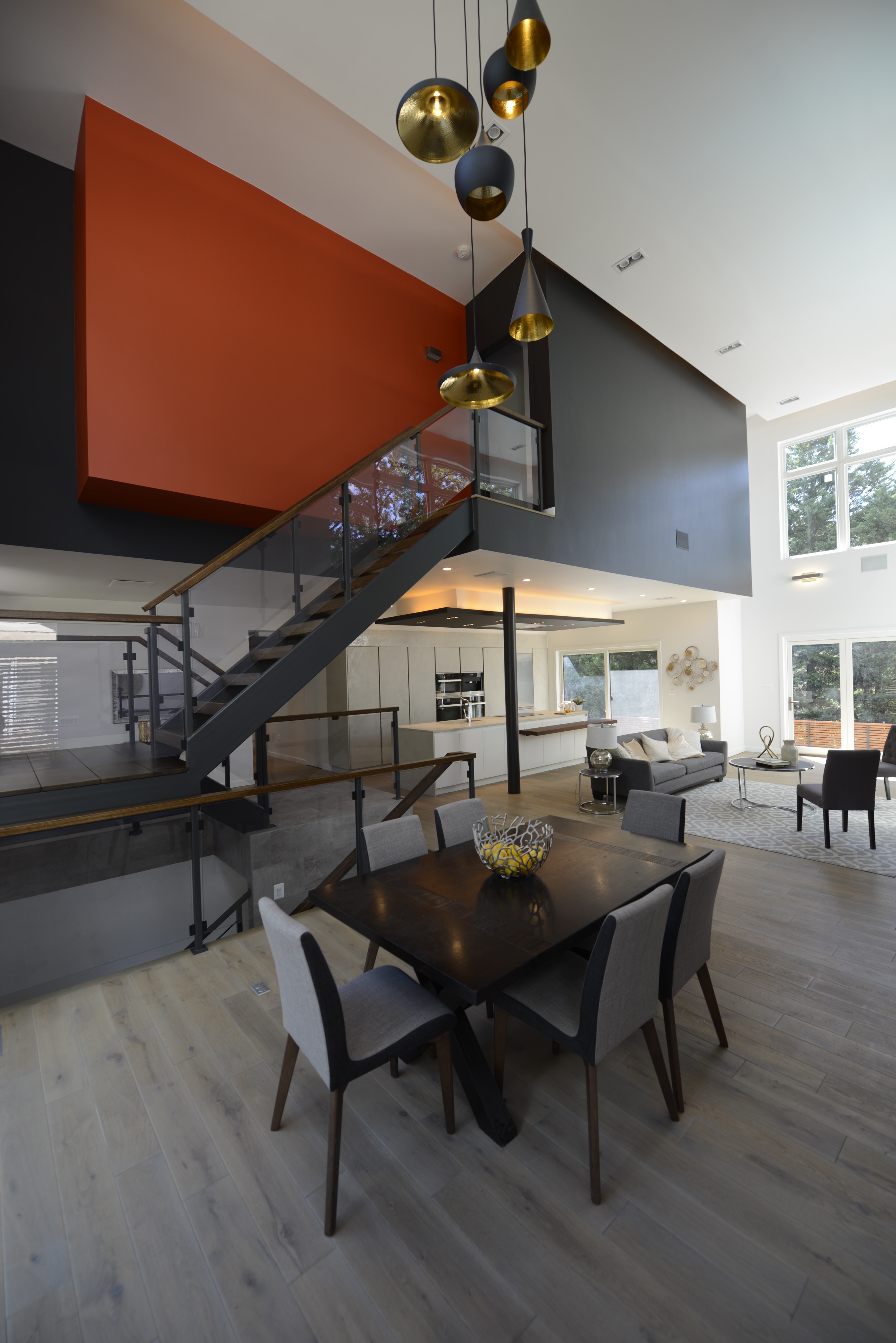
The stair issue was tougher to solve. The ultimate solution involved raising the level of the master bathroom a couple of steps above the remaining spaces in the master suite, and cantilevering the section of bathroom under the vanity over the stair. The uneven stair runs were a result of the manipulations required to make it all work. It's a Swiss watch.
By raising and cantilevering a portion of the bathroom over the stair, we were able to create enough headroom at the landing, include the freestanding bathtub and spacious shower that our clients desired. We also created a sculptural relationship between the stair and the cantilevered volume that adds interest and drama to the dining room (formal bonus!). Given the importance of that move in solving the design problem, we painted that volume red. Why not?
In sum, the cantilevers were the key to solving the spatial constraints created by the side setback limit, and without them the function and usability of all of the spaces affected would have been greatly compromised. They came about because of site constraints, not the desire for gratuitous structural gymnastics. Of course the framing was somewhat more expensive as a result, but given the cost of real estate per square foot these days...
Did form simply follow function? Did function get compromised by form, as is often the case? I believe that in this project they work as team, reinforce each other, and are inseparable.
For more photos of this project, go here
All photos by Michael K. Wilikinson, Photographs, mkw1.com


